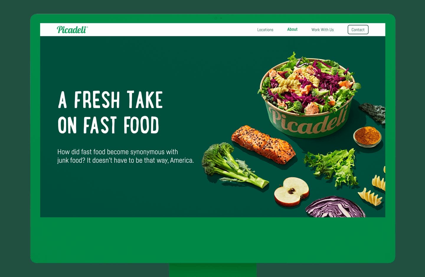
Project — Redefine fast food for the American market by bringing Picadeli to an existing retail space near them. Originally a staple in Europe with thousands of locations, Picadeli aims to make every American understand that “fast food doesn’t have to be junk food.”
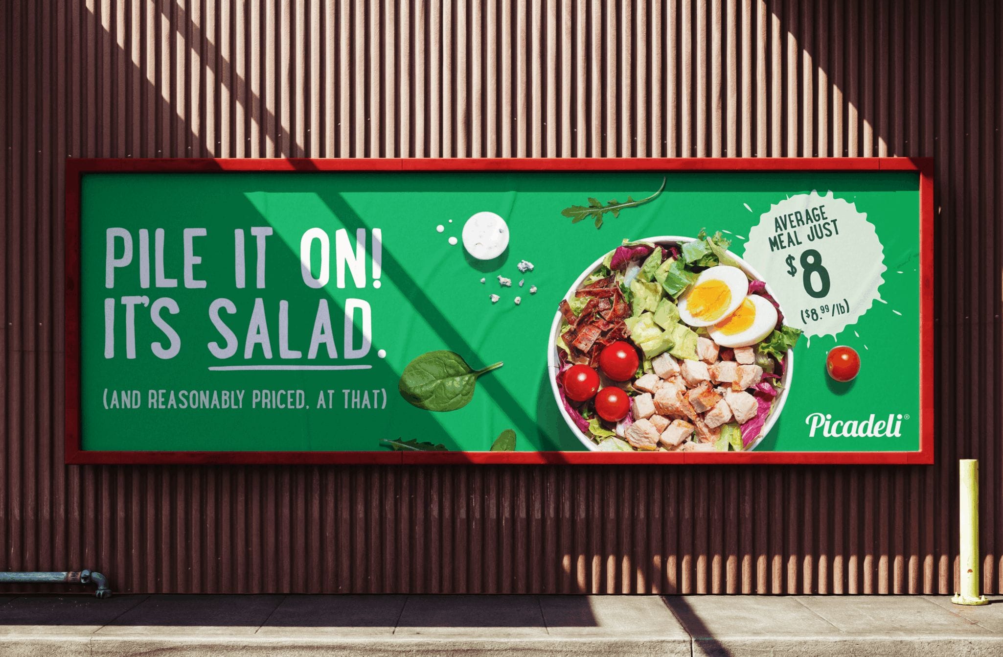
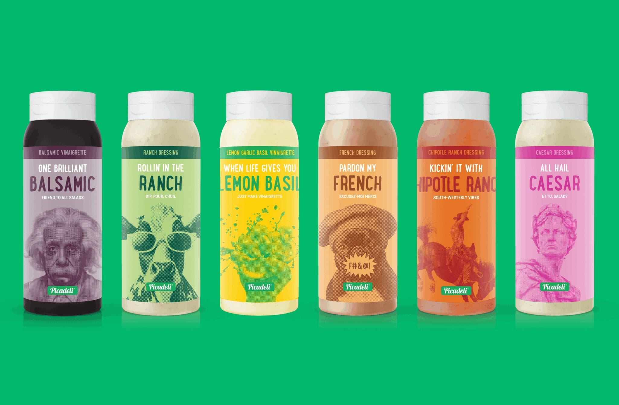
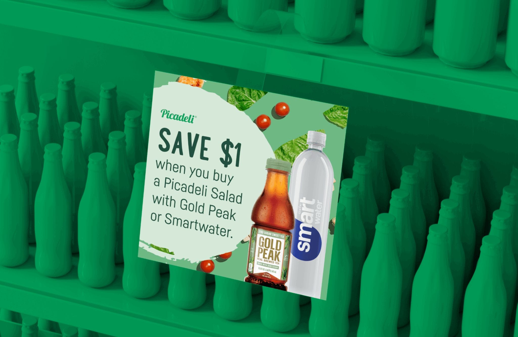
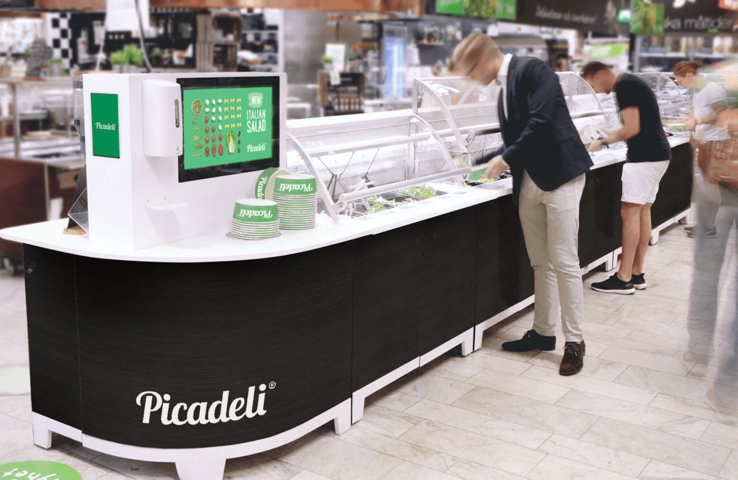
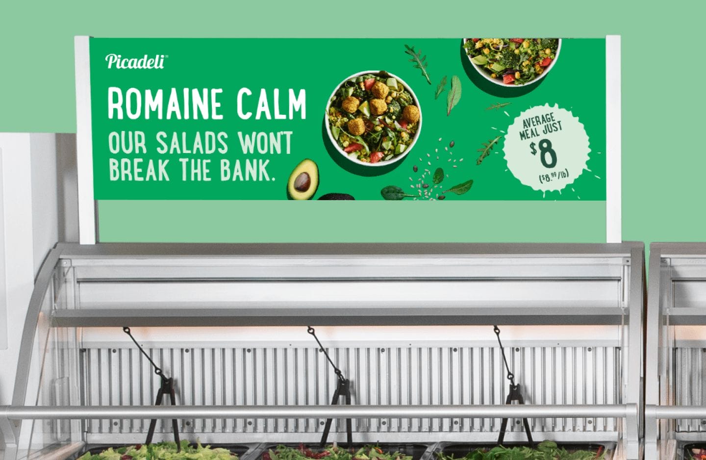
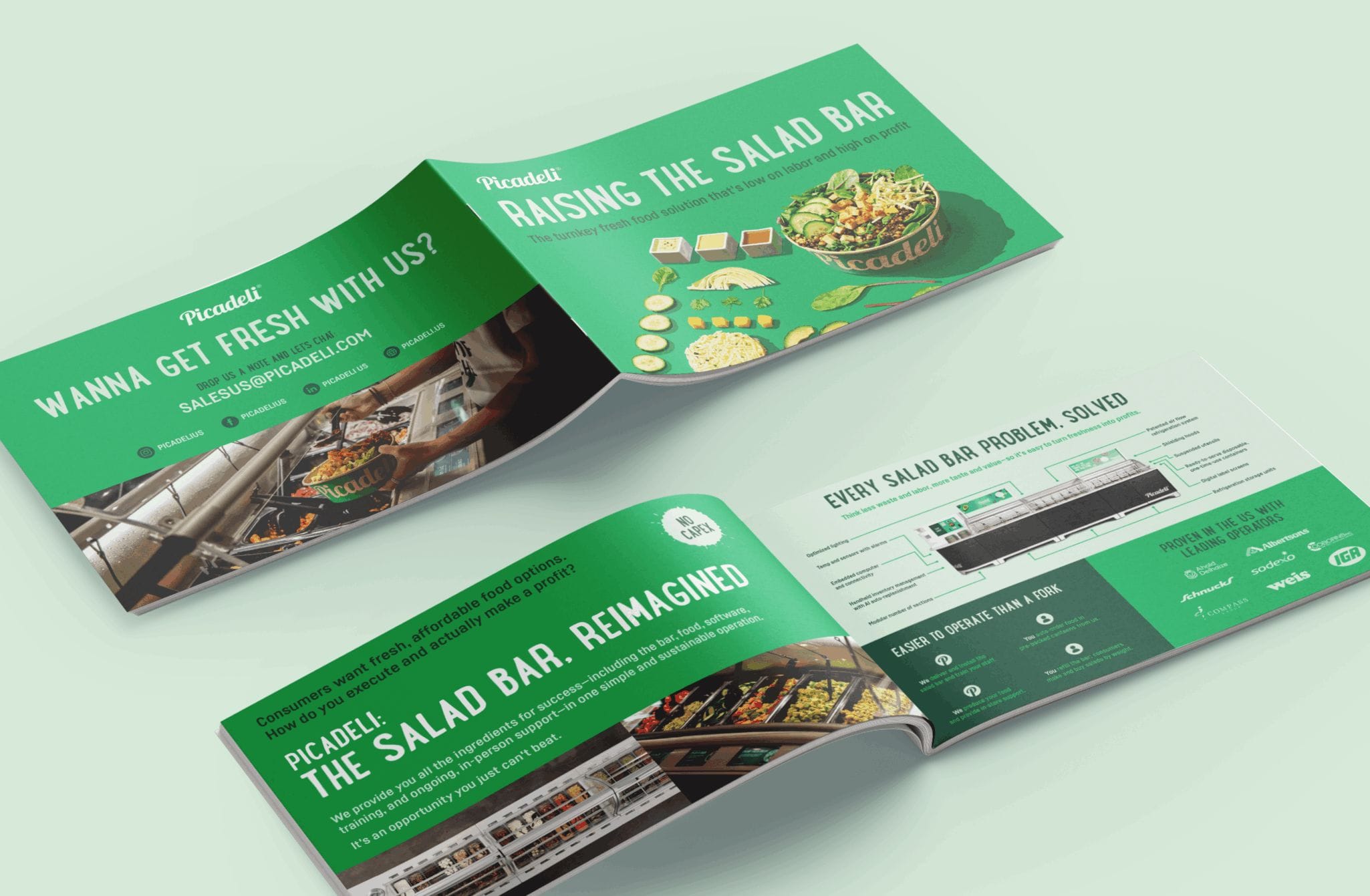
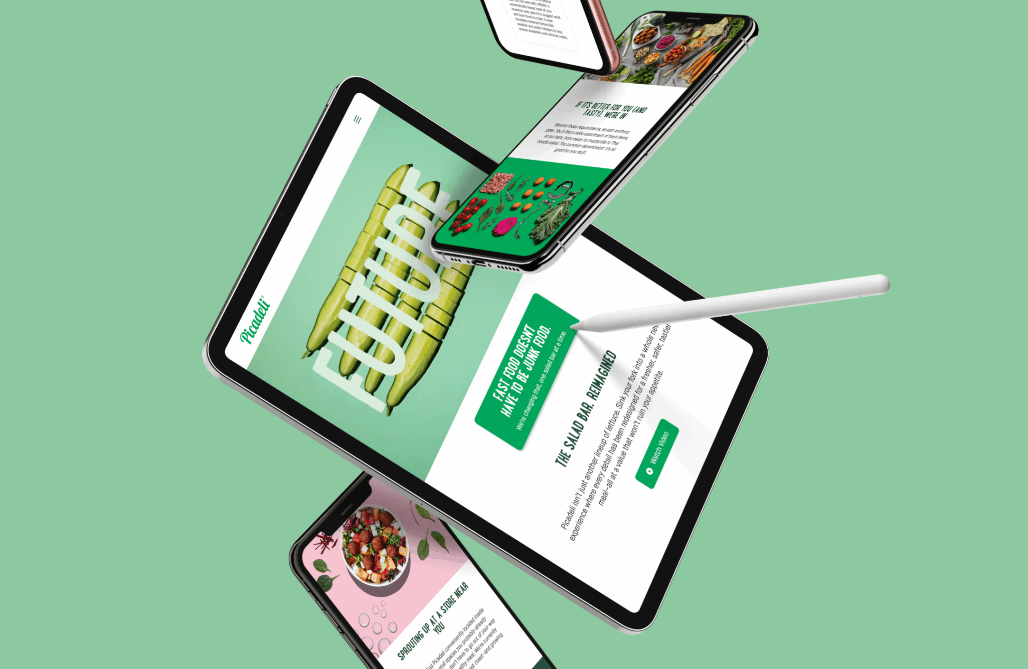
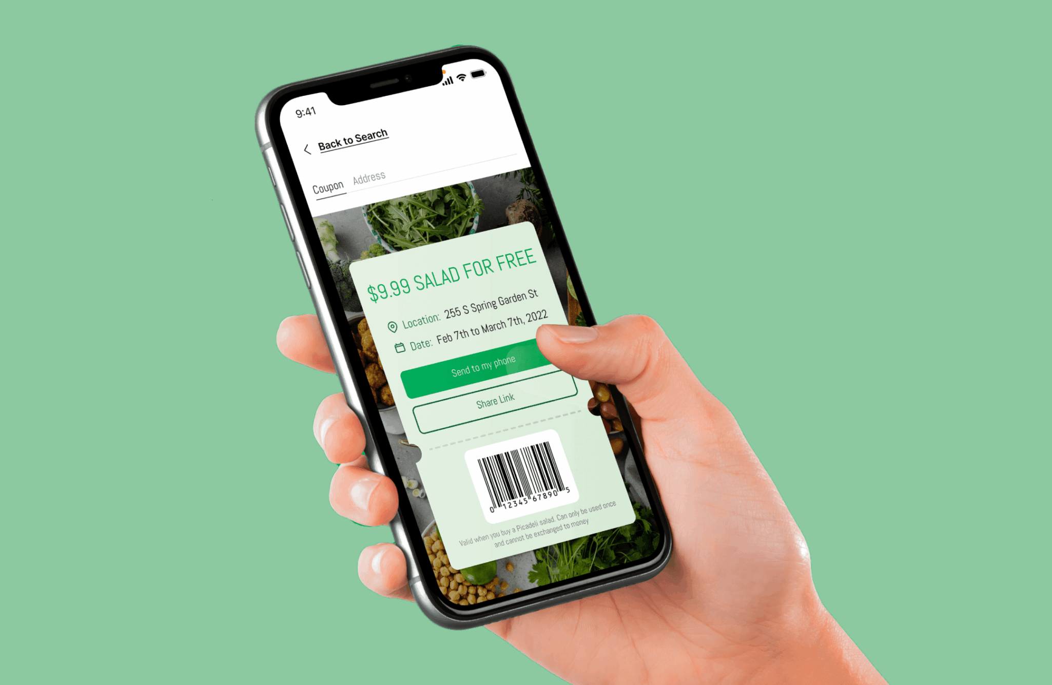
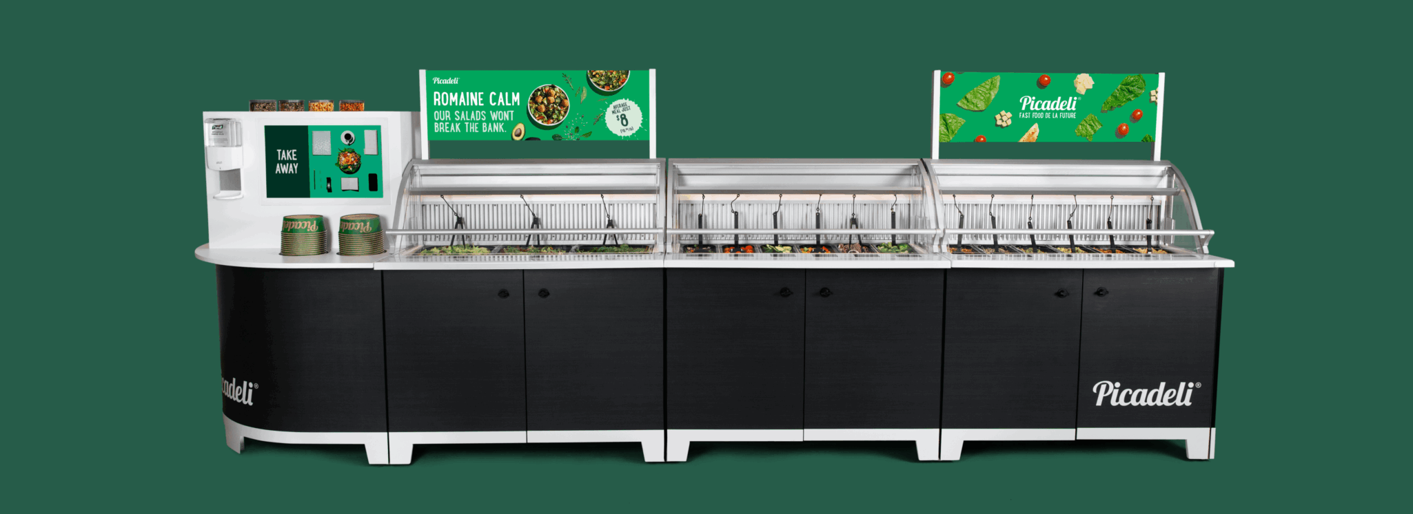
Strategy and Creative — Picadeli’s North American expansion team engaged K+L to refine their positioning and communication for the U.S. market. We revamped messaging, in-store design, packaging, traditional advertising, and digital strategy to help U.S. consumers appreciate Picadeli’s healthier fast food alternative.
Results — We are helping to raise the bar in every way. Our B2B awareness efforts are helping grocers recognize that Picadeli has all the ingredients for success, with new locations sprouting up across the country each week. Meanwhile, B2C efforts have the public piling up the veggies and embracing the salad bar, reimagined.
- Advertising
- Collateral
- Digital Strategy
- Environmental Graphics
- Packaging
- Verbal Identity
